
Start with the wall, not the frames
The easiest mistake is buying frames first and trying to make them fit later. Start by looking at the wall size, the furniture below it, the amount of natural light, and how far people will stand back to view it. A narrow passage in Parkhurst needs a different plan from a double-volume lounge in Sandton or a reception area in Midrand. If the wall sits near a window, think about glare and direct sun. In stronger coastal light, especially in Cape Town and Durban, UV-protective glass can help keep prints and photographs looking good for longer.
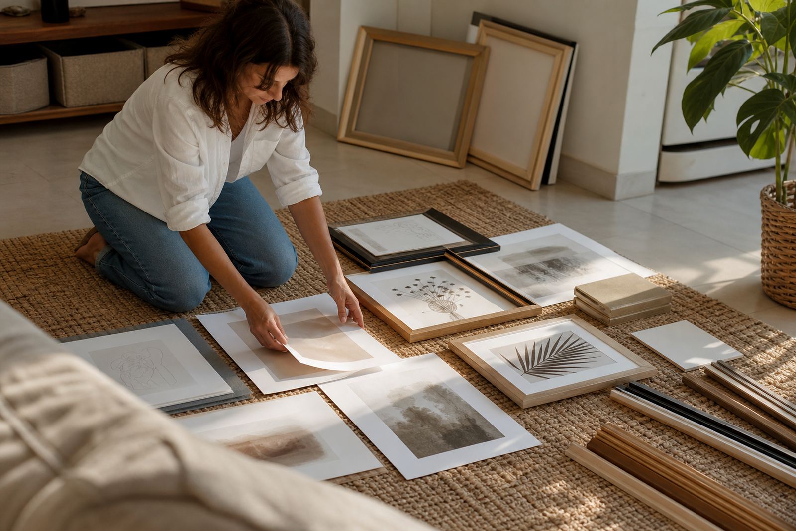
Before hanging anything, mark out the full shape on the floor with kraft paper or newspaper. This lets you test spacing without making unnecessary holes in the wall. It also helps you see whether the layout feels too tight or too spread out. In South African homes where walls are often used for both décor and practical storage, the wall should still breathe a bit. Leave enough space around the outside edge so the arrangement does not feel cramped.
- Measure the wall and the furniture below it.
- Choose a centre point and work outwards.
- Keep the main viewing height around eye level.
- Allow extra clearance above sofas, sideboards and stair rails.
Choose a layout that suits the room
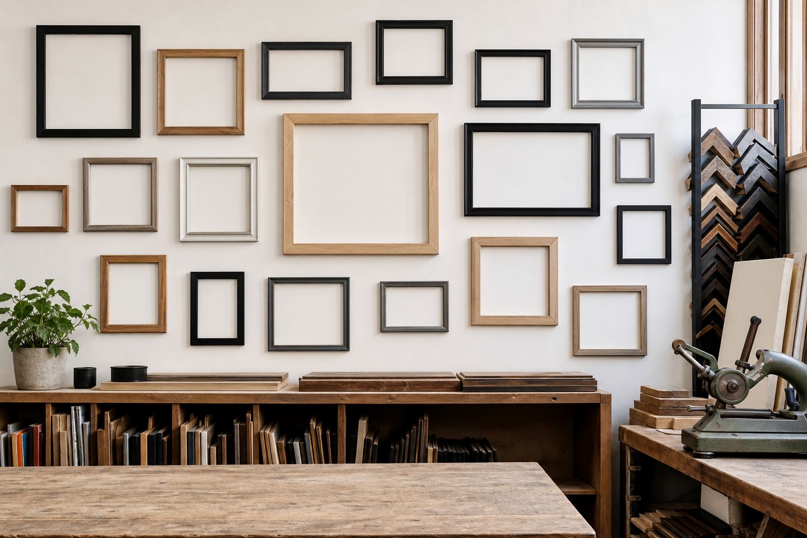
There is no single correct gallery wall layout. The best one depends on the room and the type of artwork you are hanging. A grid works well when you have a set of similar frames and want a neat, ordered look. This suits hallways, studies and formal living rooms. A salon-style layout gives more freedom and works well for mixed frame sizes, family photographs and collected artwork. If the room already has busy textiles or patterned furniture, a more structured layout can keep the space from feeling too full.
For long, narrow walls, a horizontal line of frames can guide the eye without making the room feel shorter. For taller spaces, such as stairwells, a vertical flow can work well if the spacing remains consistent. In Johannesburg homes, where open-plan living areas often connect directly to dining rooms and kitchens, the wall arrangement should be visible from more than one angle. That means the overall shape matters as much as each individual picture.
- Grid: clean and formal, best for matching sizes.
- Salon wall: relaxed, layered and ideal for mixed pieces.
- Linear row: useful above furniture or in long passages.
- Cluster: good for a small group of special images.
Keep spacing consistent, even when the frames differ
Spacing is what makes a gallery wall look considered. Even if the frames are different sizes, the gaps between them should feel deliberate. A common guide is to keep the space between frames within the same range across the whole wall, usually about 5 to 8 cm for smaller pieces and a little wider for larger works. If the gaps jump around, the eye reads the wall as unfinished. Consistent spacing gives the whole arrangement a calm, balanced rhythm.
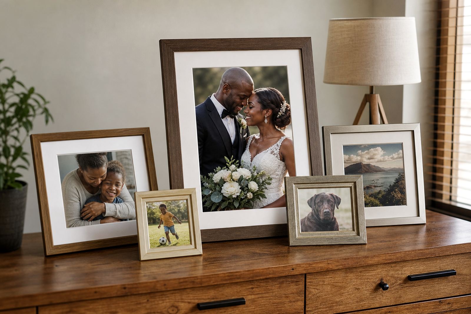
Mat boards can also help unify mixed images. If you have a combination of old family photos, line drawings and certificates, a matching mount colour pulls the wall together. White, off-white and soft grey are safe choices, but warmer tones can work better in rooms with timber floors or sand-coloured walls. For homes near the coast, it is also wise to choose materials that handle humidity better, especially in Durban where moisture can affect paper and backing boards over time.
When you are not sure, lay all the frames down and step back. If one area feels heavy, move a larger frame slightly out or add a small gap. The aim is not perfect symmetry in every case, but visual balance across the full wall.
Mix frame styles without making it look messy
Mixed frame styles can look very good, but they need a common thread. That thread might be colour, frame depth, mount tone or subject matter. For example, black frames can sit alongside oak and white frames if the artworks themselves share a similar palette. Likewise, a wall of travel photos and family portraits can work if the frames all have a similar width. The point is to give the eye one or two repeated elements to hold onto.
If you want a more curated look, use one frame colour and vary only the sizes. If you prefer a collected feel, mix timber, painted and metal-look frames but keep the artwork edges aligned in places so the wall still has structure. In a gallery or office setting, too much variation can distract from the work on display. In a family home, a little variety adds warmth, just avoid mixing everything at once or the wall can start to feel cluttered.
- Repeat one colour across the wall.
- Use the same mount colour for mixed artwork.
- Keep frame widths in a similar range.
- Balance highly decorative frames with plain ones.
Use gallery walls to solve real room problems
A gallery wall is not only about filling space. It can also correct awkward room proportions, soften a large blank wall, or bring focus to a corner that otherwise feels forgotten. In apartment living, where room sizes can be compact, a well-planned wall can create a strong visual feature without taking up floor space. In larger homes, it can make a long corridor feel purposeful and connected. It can also help tie together different colours in a room, especially when furniture has been collected over time.
For municipal and body corporate settings, especially in shared buildings, it is worth checking any rules before fixing items to common walls or stairwells. If you are hanging in a commercial space, secure installation matters even more. A reception wall in Pretoria, for example, may need a cleaner layout and stronger fixings than a family lounge. If the wall includes mirrors, heavier framed works or canvas pieces, proper hanging hardware should be matched to the wall type, whether it is brick, drywall or plaster. In older houses, this can save a lot of repair work later.
Try a local example before you commit to the full wall
Picture a Parkhurst dining room with a sideboard against a pale wall and three framed black-and-white prints above it. The first row is centred over the furniture, with the largest image in the middle and smaller frames flanking it. Above that, two smaller pieces continue the line, creating a simple stepped shape. The layout feels calm, and it does not fight with the room’s furniture. Now compare that with a Rosebank hallway where the wall is narrow and the light changes through the day. A vertical arrangement with evenly spaced frames works better there, because it guides movement through the space instead of stopping it.
This is why a site visit or design consultation can be useful when you are planning a bigger wall. At Bright Frames, the team works with homes and galleries across Johannesburg, Pretoria, Midrand, Sandton, Rosebank, Cape Town and Durban, helping clients match layout, materials and finish to the room. Sometimes a small change, like a different mount width or a slightly larger frame, makes the whole wall sit better. The best gallery wall is the one that looks settled in the room, not forced into it.
If you are unsure where to begin, start with three or five pieces, then build from there. A wall does not need to be completed in one day. It can grow as you collect new photographs, artworks and memories.