
Why neutral frames make mixed art feel considered
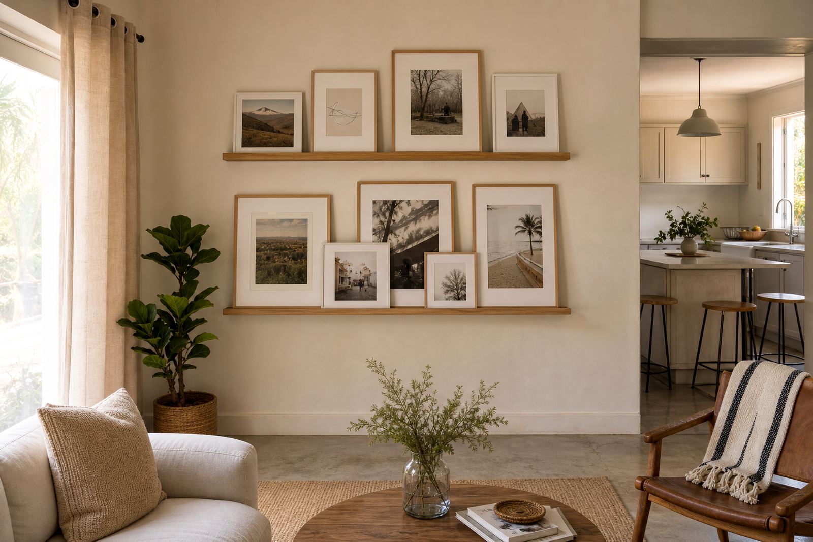
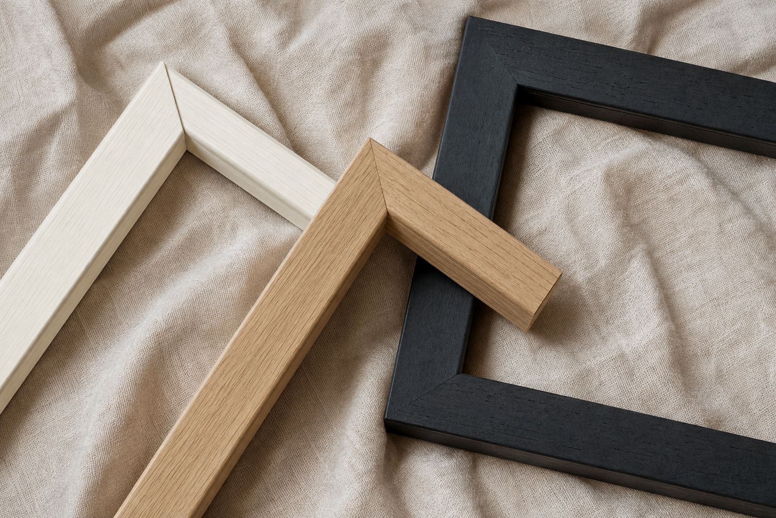
When a room holds portraits, line drawings, family photographs and a few louder pieces, a neutral frame palette gives the whole wall some breathing room. Black, white, oak, ash, soft grey and muted metal finishes keep the focus on the artwork while still giving each piece a clean edge. That matters in homes across Johannesburg and Pretoria where one wall might hold a child’s print, a wedding photograph and a small oil painting all at once.
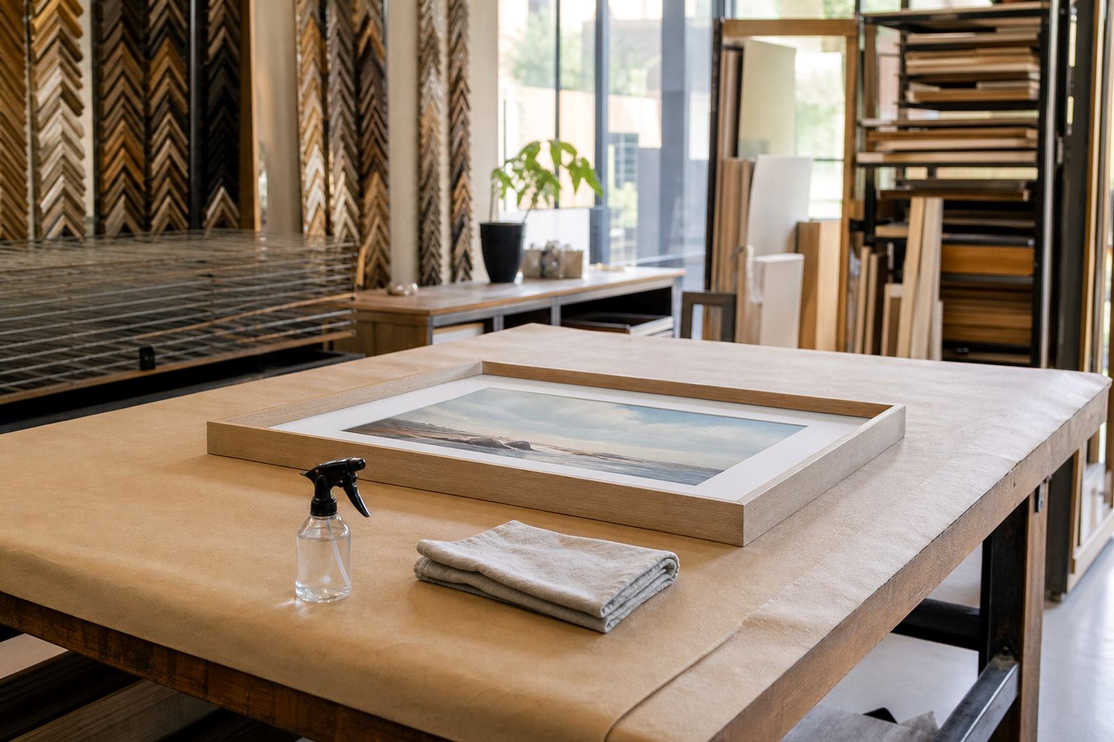
Neutral does not mean plain. It simply means the frame colour supports the art instead of competing with it. In our Parkhurst studio, we often see clients choosing a restrained palette because they want the room to feel collected over time, not overdone. That approach works well in galleries too, especially when several artists are being shown in the same space.
A good neutral frame also helps if you change artwork regularly. A photographer may swap prints for a new exhibition, or a homeowner may move pieces from a lounge to a passage. A steady frame colour makes those changes easier and keeps the overall look consistent.
Choosing between black, white, timber and soft metallics
Black frames are still the most useful all round option for many interiors. They suit monochrome photography, bold contemporary prints and works on white paper. White frames feel lighter and are often the better choice for coastal homes in Cape Town or Durban, where bright rooms and strong daylight can make heavy finishes feel too dark. Timber tones bring warmth and work especially well with landscapes, botanical studies and family memories.
Soft metallics can be a good middle ground. Brushed silver, champagne and muted bronze read as neutral but add a little depth. They work nicely in offices, reception areas and gallery settings where the framing needs to look tidy under spotlights and natural light. The key is to match the tone to the artwork, not just to the wall colour.
- Use black for strong contrast and crisp presentation.
- Use white for light rooms and softer subject matter.
- Use natural timber for warmth and a more relaxed finish.
- Use muted metal tones when you want a refined, low-key sheen.
How to frame different artworks without losing the room
Mixed walls work best when the frames share one or two things in common. You might vary the size and artwork type, but keep the palette steady. For example, a collection of four family photographs, two watercolours and one certificate can all sit together if the frames use the same black finish and the same mount style. That gives the eye a pattern to follow.
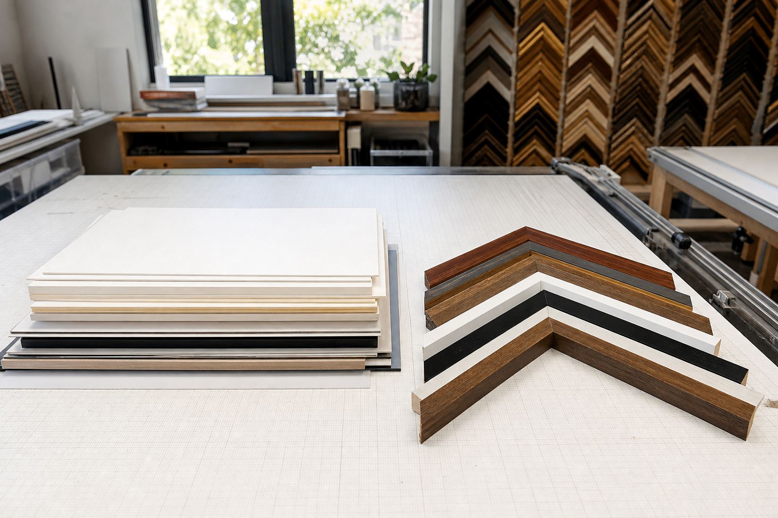
Mount colour matters as much as frame colour. Off-white, warm white and soft grey mounts help avoid a harsh contrast, especially with older prints or delicate paper works. If you are framing on a budget, this is one of the easiest places to keep things calm without having every frame match exactly. Our framing specialists often suggest a lighter mount for darker rooms and a slightly warmer mount for pale walls.
If you are working with a gallery wall in a suburban home, measure carefully before you start. A layout that looks balanced on paper can feel cramped once it is on the wall. Allow enough space between pieces, and keep the outer frame lines level. That small discipline makes a neutral palette look ordered rather than dull.
A practical palette for Johannesburg homes and offices
In Parkhurst, where many homes mix older architecture with newer interiors, neutral frames often solve a common problem: different artworks from different periods need to sit together in the same room. A single palette can help a hallway feel intentional even when the pieces have been collected over years. In Sandton offices, neutral framing is also useful because it holds up well in waiting areas, boardrooms and private offices where the decor changes less often than the art.
For a simple and dependable set-up, we usually suggest one of three combinations: black frame with white mount, natural timber with warm white mount, or soft grey frame with off-white mount. These options suit photographs, prints, certificates and small paintings. They also work across our Johannesburg, Pretoria, Midrand and Rosebank services, where clients often need one look that can be repeated in several rooms or even across different sites.
- Keep one frame colour across a series for a calm wall display.
- Use matching mounts to tie different image sizes together.
- Choose glazing based on light, especially near windows and strong direct sun.
- Ask about collection and delivery if you are framing several pieces at once.
Glazing, spacing and the quiet details that matter
Neutral framing works best when the finish is clean. Glass choice is part of that. Standard glass is fine for many prints and photographs, while clearer glazing may be worth considering for pieces that need better visibility in bright rooms. In South African homes where afternoon light can be strong, and where dust is a constant part of daily life, proper sealing and sensible glass choice help protect the artwork and keep the frame looking tidy for longer.
Spacing inside the frame is another detail that changes the result. A narrow mount can feel neat and modern, while a wider mount gives paper art more room to breathe. For mirror framing, a neutral palette is often the safest route because the mirror already brings light into the room. In a small passage or a bathroom, a simple timber or black finish usually works better than something too shiny.
If a frame is being repaired or refitted, the original look can often be kept while improving the structure. That is useful for older pieces, inherited photographs and sentimental items that need reframing without losing their character.
When neutral framing should be repeated and when it should change
A repeated neutral palette is the right answer when the art is varied but the room is limited. It keeps a home from feeling busy and it helps galleries present several artists with a common thread. But not every wall should use the exact same finish. A black frame may suit a bold print in the lounge, while a pale timber frame may be better for a nursery or a sunlit study.
Think about the wall colour, the furniture nearby and the type of artwork before choosing. A charcoal wall can carry a white or light timber frame nicely. A cream wall often suits black or dark timber. If the room has a lot of texture already, such as patterned upholstery or exposed brick, a simpler frame will usually work better. In our experience, the best neutral palette is the one that feels quiet enough to let the room settle, but specific enough to make each piece look cared for.
Bright Frames offers custom framing, ready-made advice, mount cutting, canvas stretching, glass replacement, frame repairs, reframing and artwork installation. For clients in Cape Town, Durban and across Gauteng, that means the same calm framing approach can be carried through from one piece to the next, even when the art changes over time.