

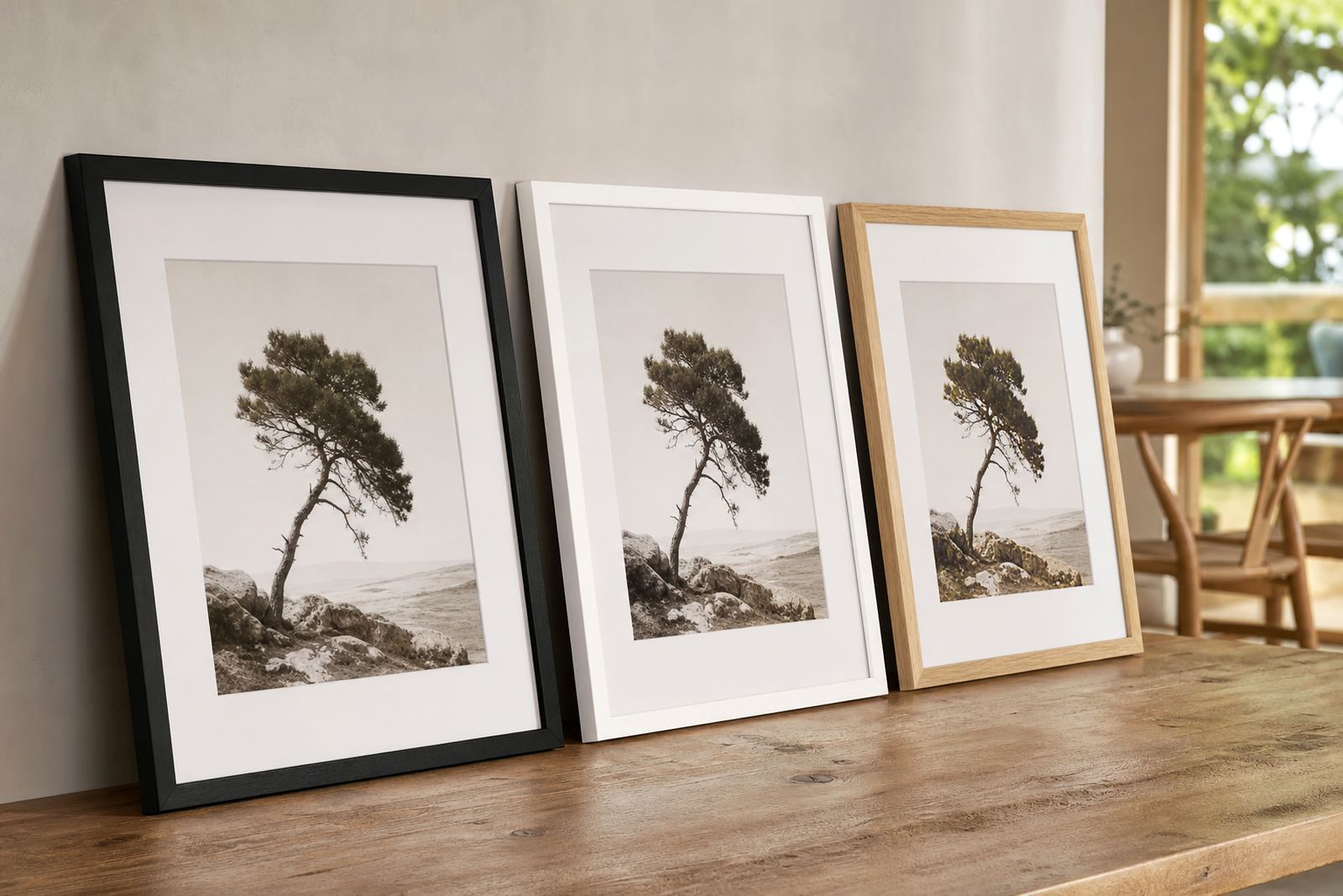
Why frame colour changes the whole read of the artwork
The colour of a frame controls attention. A dark timber or black frame pulls the eye inward and gives structure, while a pale or natural finish keeps the look lighter and less formal. If the room already has strong colours, the frame should usually calm things down rather than compete with it.
For photographs, frame colour can sharpen contrast and make the image feel more defined. For paintings, prints or certificates, the right colour can either add weight or let the art breathe. That is why two frames of the same profile can give very different results once the colour changes.
- Dark frames suit bold images, monochrome work and formal rooms.
- Light frames work well in bright spaces and with softer interiors.
- Natural timber tones add warmth without shouting for attention.
Matching frame colour to the mood of the room
Think first about the mood you want in the room. A study or boardroom often benefits from deeper tones that feel settled and focused. A bedroom, passage or family room may call for softer colours that do not weigh the wall down. In a home with lots of natural light, the frame can be a little stronger because the room will carry it well.
In Parkhurst and Rosebank, many clients ask for frames that suit both modern finishes and older homes with character. A matte black frame can sit neatly beside clean lines and neutral walls, while a washed oak or ash finish works well with warm floors and textured fabrics. For gallery spaces, a consistent frame colour can bring different artworks together without making the display look rigid.
- Use black for clean contrast and a crisp finish.
- Use white or off-white to keep attention on the image.
- Use timber tones for warmth, especially in living rooms and reception areas.
- Use metallic finishes sparingly if the room already has strong reflective surfaces.
What to consider before choosing black, white or timber
Black is the safest choice when you want definition. It works well for photography, certificates and contemporary art, but it can feel heavy if the image is small or the wall is dark. White and off-white frames are useful where the aim is to keep things light, though pure white can feel too sharp in some homes. Natural timber is often the most flexible, especially if the colour has some grain and movement in it.
There are also practical points. In Johannesburg, many homes have neutral painted walls, so the frame has to work with floor colour, furniture and window light. In coastal cities like Durban, humidity can affect finishes over time, so a properly sealed frame and good quality backing matter just as much as the colour. If a piece will hang near a kitchen, bathroom or bright window, ask how the finish will behave in that spot.
- Choose black when you want definition and a neat outline.
- Choose white when the wall is busy and you want the art to stay open.
- Choose timber when you want warmth and a more lived-in look.
- Ask about moisture and sun exposure before finalising the finish.
Using colour to guide contrast, not fight it
A good frame colour should support contrast rather than create conflict. If the artwork already has a dark edge, a heavy frame may make it feel boxed in. If the image is pale or low contrast, a frame with a stronger line can help it hold its own on the wall. The same idea applies to mirrors. A mirror frame should suit the room, but it also needs enough presence so the piece does not disappear.
When clients bring in family photos, school certificates or exhibition prints, we often compare options against the actual wall colour. What looks good in the studio may change once it is against cream paint, exposed brick or a deep coloured feature wall. This is where a careful design consultation helps. It is easier to see the final balance when the frame, mount and image are considered together.
Colour choices for galleries, offices and collection walls
For galleries and offices, consistency often matters more than decoration. A repeated frame colour can create rhythm across a wall, even when the images are very different. Black, white and natural timber are common because they work with many types of work and do not distract from the piece itself. If a gallery rotates exhibitions, choosing one or two reliable frame colours can save time and keep the presentation tidy.
Collection walls at home can be handled the same way. You do not need every frame to match exactly, but there should be a reason behind the mix. For example, a family wall may combine black frames for photographs and natural timber for sketches or prints. Keep the palette tight and the finishes consistent, then the wall feels planned rather than random.
- Keep a gallery wall to two or three frame colours at most.
- Repeat one finish for visual order across different sizes.
- Use consistent mount colours if the frames vary.
- For offices, choose finishes that are easy to maintain and simple to clean.
A Parkhurst example: one artwork, three very different results
A client in Parkhurst recently brought in a signed print for a lounge with pale walls, timber floors and a dark leather chair. We showed three frame colour options: matte black, warm oak and a soft white. The black made the print feel sharper and more grounded. The oak brought out the warmth in the floor and softened the whole room. The white kept it light, but the piece lost some presence from across the room.
That kind of choice comes down to where the work will hang and what role it must play. If the artwork is a focal point, a stronger frame can help. If the piece is part of a larger group, a quieter frame may be better. There is no single right answer, but there is usually a best fit for the room.
How Bright Frames helps you choose with confidence
At Bright Frames, we guide clients through the colour choice step by step. You can bring in artwork, photographs, mirrors or certificates, and we will talk through how each frame colour changes the final effect. We also consider the mount, glass and finish so the full piece works together. If you need advice for a home in Pretoria, a gallery in Cape Town, or an office in Midrand, the same practical approach applies.
Our Parkhurst studio handles custom framing, ready-made advice, mount cutting, canvas stretching, reframing, repairs, glass replacement and installation. We also arrange collection and delivery where needed. For many clients, the best result comes from seeing the options in person, comparing them side by side and choosing the one that feels right in the room, not just on the sample table.
If you are unsure where to begin, start with the wall, the light and the purpose of the piece. From there, the frame colour becomes easier to decide and the finished work sits where it should.