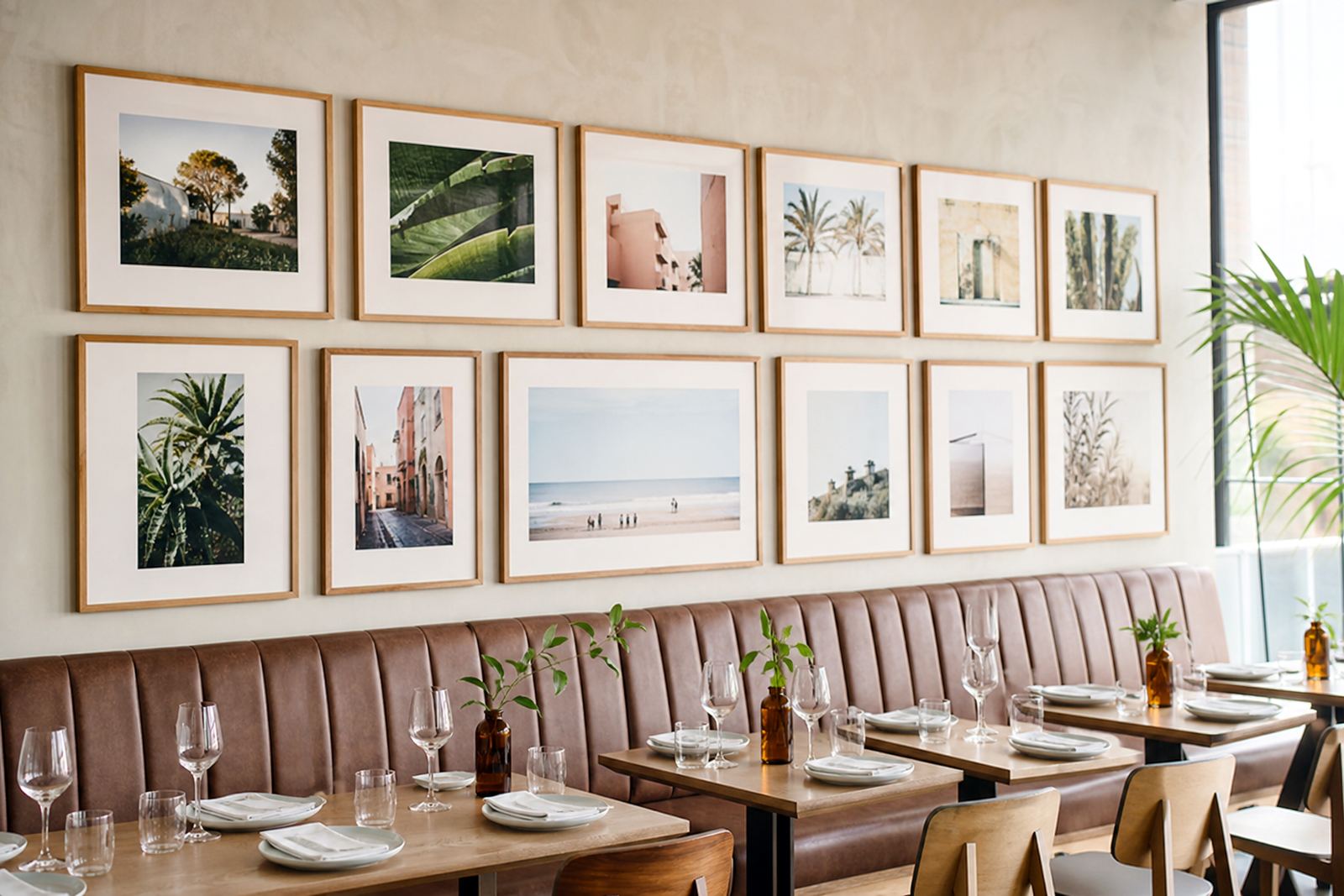

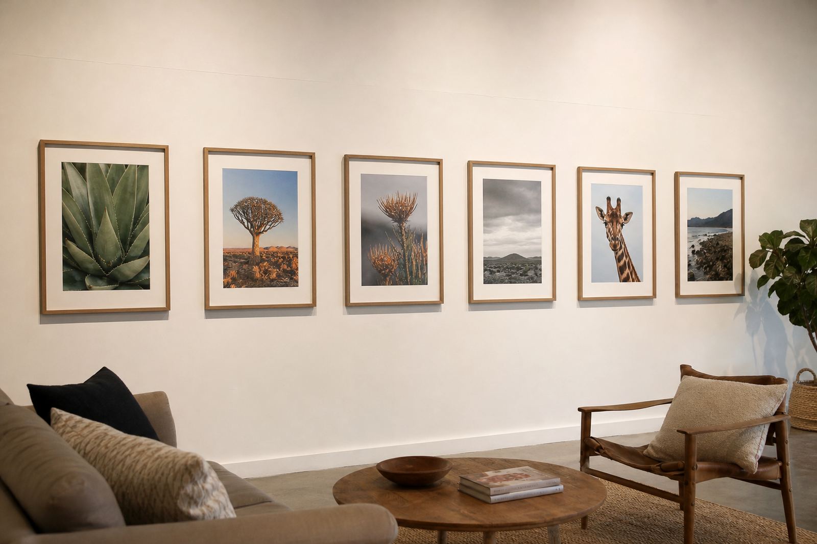
Why a consistent frame language helps viewers read the show
In a gallery setting, visitors take in an exhibition quickly. If one piece has a heavy black frame, another has a warm timber profile and a third is floating in a narrow white moulding, the eye keeps stopping to re-adjust. That can be fine for a mixed salon, but for a curated exhibition it often weakens the overall message.
Consistency does not mean every work must look identical. It means the framing choices should share a logic. A common profile, similar mount spacing, or a repeat in colour tone can help the eye move from one artwork to the next without interruption. The result is a calmer room and a stronger read on the artist’s intent.
For South African venues, this matters even more in spaces where exhibitions change regularly and installation time is tight. When the framing system is planned properly, the team spends less time trying to make mismatched pieces behave on the wall and more time on layout, light and sightlines.
Choosing frames that support the work not compete with it
The best exhibition framing usually sits in the background. It should hold the work securely and suit the style of the piece, while leaving the image, print or object to do the talking. For photography, a slim profile and clean mount can keep attention on the image edges. For works on paper, a slightly wider mount can give breathing room and protect the surface from touching the glazing.
In a mixed show, it is often useful to set a house standard for frame colour and depth, then allow for small variations where the art needs it. That can be a matte black line for all monochrome pieces, or a natural wood range for botanical and coastal work. The point is to create enough sameness that the exhibition feels planned, without flattening every artwork into the same mould.
- Use one or two frame colours across the show where possible.
- Keep mount widths consistent for works of similar size.
- Match glazing choices to the lighting and viewing distance.
- Use deeper frames for works that need shadow gaps or spacers.
Mounts, spacing and glazing make the difference at close range
Many visitors view framed work from just a metre or two away, especially in smaller galleries and sales rooms. At that distance, small differences in mount cutting, corner alignment and glazing quality become obvious. A mount that is 2 mm off centre or a spacer that is uneven can make the whole wall feel untidy, even if the art itself is strong.
This is where careful preparation pays off. Accurate mount cutting keeps margins equal, while proper glazing choice helps protect against dust, fingerprints and UV exposure. In Johannesburg, where interiors can get dry from air conditioning and dusty from nearby traffic, clean sealing and careful handling are worth the effort. At the coast, humidity can affect paper, canvas and timber more quickly, so the frame build must be chosen with that in mind.
For exhibitions that travel between cities such as Johannesburg, Pretoria, Cape Town and Durban, consistency also helps with packing and re-hanging. When the frames are built to similar standards, transport and reinstallation are simpler, and the show can be reset with less risk of damage.
A practical approach for a Pretoria to Cape Town touring exhibition
Consider a photography exhibition that starts in Parkhurst and later moves to Pretoria, then to Cape Town and Durban. The works are varied, but the organiser wants the show to feel like one body of work from start to finish. The simplest way to do that is to set rules before framing begins: one frame colour, one mount colour, the same visible border around each print, and a consistent hanging height.
With that plan, the viewer does not get pulled out of the exhibition by frame changes from room to room. If one image needs a different treatment because of scale or surface, that piece can be handled as an exception rather than becoming the rule. It is a small shift, but it keeps the exhibition disciplined and easy to install.
It also helps the client side of the job. When collectors or galleries ask what comes next, there is a clear system. The frame schedule can be repeated for future shows, which saves time and keeps costs predictable. That matters when budgets are already stretched by printing, transport and venue hire.
- Agree the frame spec before the first artwork is mounted.
- Record exact sizes, profile widths and mount colours for later repeats.
- Test one sample under the venue lighting before committing to the full run.
- Allow time for repairs or reframing if older pieces do not match the new set.
When consistency should bend for the sake of the artwork
There are times when a rigid rule makes the exhibition weaker. A framed oil painting may need a more substantial profile than a fine art print. A mirror piece may need a different build from a watercolour. A sculptural object may ask for custom spacing that breaks the standard line. Good framing practice knows when to keep the system and when to adjust it.
The aim is not sameness for its own sake, but a sense of order. If the exhibition includes different mediums, the challenge is to build visual harmony without forcing every object into the same frame type. A design consultation can help identify where a consistent style works and where a tailored treatment will better serve the work.
In practical terms, this often means repeating one detail across the show, such as mount colour, glazing finish or frame depth, while allowing the surface and format to vary. That approach gives the exhibition a steady rhythm and still leaves room for individual pieces to stand out.
Getting the hanging right from the first wall to the last
Even the best-framed exhibition can lose its impact if the hanging is uneven. A frame line that drifts up and down, or spacing that changes from one wall to the next, breaks the consistency the viewer has already been asked to trust. The installation should respect the framing plan just as much as the framing should respect the art.
For galleries and private collections alike, it helps to work from a measured hanging chart. That keeps centre lines, top edges and group spacing steady across the room. If the show includes mirrored pieces or a mix of sizes, careful placement becomes even more important. A few millimetres can matter more than most people realise, and once a wall is up it is harder to correct than it looks.
At Bright Frames in Parkhurst, our team works with galleries, artists and collectors on custom framing, ready-made advice, reframing, glass replacement, artwork installation and gallery hanging. Whether the exhibition is staying in Johannesburg or moving across South Africa, the goal is the same: make the frames support the work, not distract from it.
When the framing, mounts and installation all follow one clear plan, the exhibition feels calm, considered and ready to be seen.