
Start with the sightline, not the first frame
When you plan a staircase gallery, begin by standing where the wall is most visible, usually at the bottom landing or the first turn in the stairs. That is where the eye reads the whole arrangement. The aim is not to fill every bit of wall, but to keep one steady visual line that connects the frames as you move up or down.
In many Johannesburg homes, especially in Parkhurst and Rosebank, staircases have a tight turn or a narrow wall section beside the balustrade. In those spaces, a clean line matters more than symmetry. A photo series, small artworks, or a mix of frame sizes can all work well if the top edges, centres, or bottoms are aligned consistently. Pick one rule and stick to it, even if the stair flight changes angle. That single decision makes the whole wall feel planned rather than random.
- Choose a clear anchor point at the bottom or top landing
- Keep the same spacing between each frame, usually 50 to 80 mm
- Follow one alignment rule: top edge, centre line, or bottom edge
- Leave enough wall around the group so the layout can breathe
Measure the run and mark the line before hanging anything
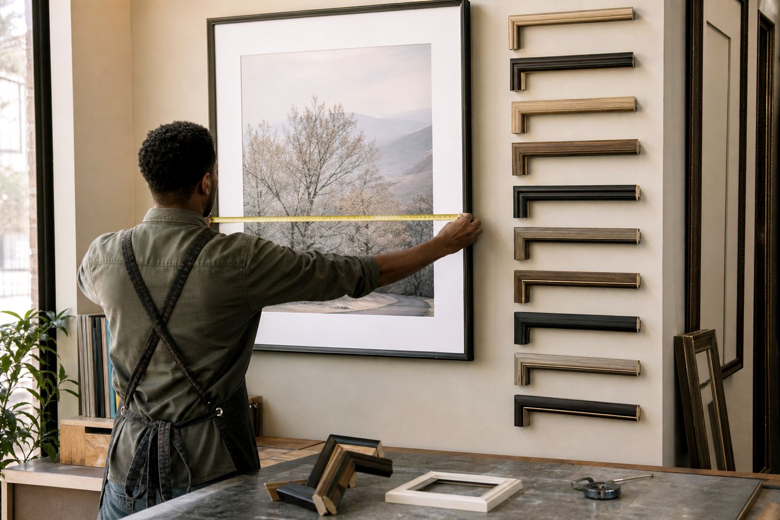
A staircase wall is one of those places where a tape measure saves a lot of rework. Start by measuring the wall length, the stair rise, and the available wall height at each section. If the stairs change direction, sketch the wall as two or three parts and mark where the line should continue. This is the stage where people often rush, then end up with one frame sitting slightly too high or too low. It is a small thing, but it shows.
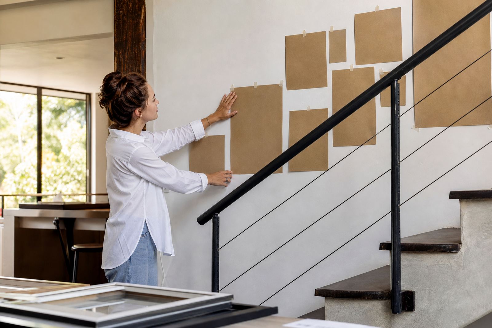
For homes with tiled stairs, polished floors or painted plaster walls, use paper templates first. Cut sheets to the exact frame sizes and stick them up with removable tape. Step back from the bottom of the stairs and check the flow from different angles. In a split-level house in Midrand, for example, a set of six family prints might look balanced on paper, but once viewed from the landing the spacing can feel tight. A few extra centimetres between pieces often solves the problem.
- Measure the full stair wall and each turn separately
- Use paper cut-outs to test the layout before drilling
- Check the view from the bottom, middle and top of the stairs
- Allow extra space if the wall is visible from more than one angle
Use frame sizes that repeat, then mix carefully
The easiest staircase gallery layout is built around repetition. Repeated frame sizes create rhythm, and rhythm is what keeps a long stair wall from feeling busy. A sequence of A4, A3 and square frames can work well if the proportions are repeated in a pattern. This is especially useful for photography collections, certificates, or travel prints.
Mixing styles can still work, but it needs a clear limit. For example, use one frame colour for all the pieces, then vary the image sizes inside that frame style. Or keep the sizes close together and use one accent frame for a special artwork. Too many profiles, finishes and frame widths can break the line. In humid coastal homes such as Durban, it also helps to choose materials and glazing that suit the environment, because a staircase often catches warm air movement and dust from open doors and windows.
- Repeat 2 or 3 frame sizes for a steady rhythm
- Limit the number of frame finishes in one staircase group
- Use one accent piece only if you want a focal point
- Choose materials that suit the home’s light, heat and humidity
Keep the spacing even, even when the wall turns
A staircase gallery layout only works when the spacing stays true from one frame to the next. If one gap is 60 mm and the next is 100 mm, the eye catches it straight away. The same applies when the wall turns at the landing. The gap should still read as part of the same family of frames, not as a new arrangement that starts over.
A good method is to decide on one spacing measurement and use it all the way through. For many homes, 60 to 75 mm is a practical range, but the exact number depends on the size of the frames and the height of the wall. Larger frames can handle more space between them, while small prints usually need a tighter relationship. If you have a long staircase in a Sandton home, you may want the pieces to follow the angle of the stairs more closely, almost like a visual handrail. That line should feel calm and measured, not forced.
If the staircase is narrow, avoid hanging frames too close to the stair edge where shoulders or bags may knock them. It is worth leaving a little extra clearance, especially in busy family homes where people move quickly up and down the stairs.
Match the frame choice to the kind of artwork
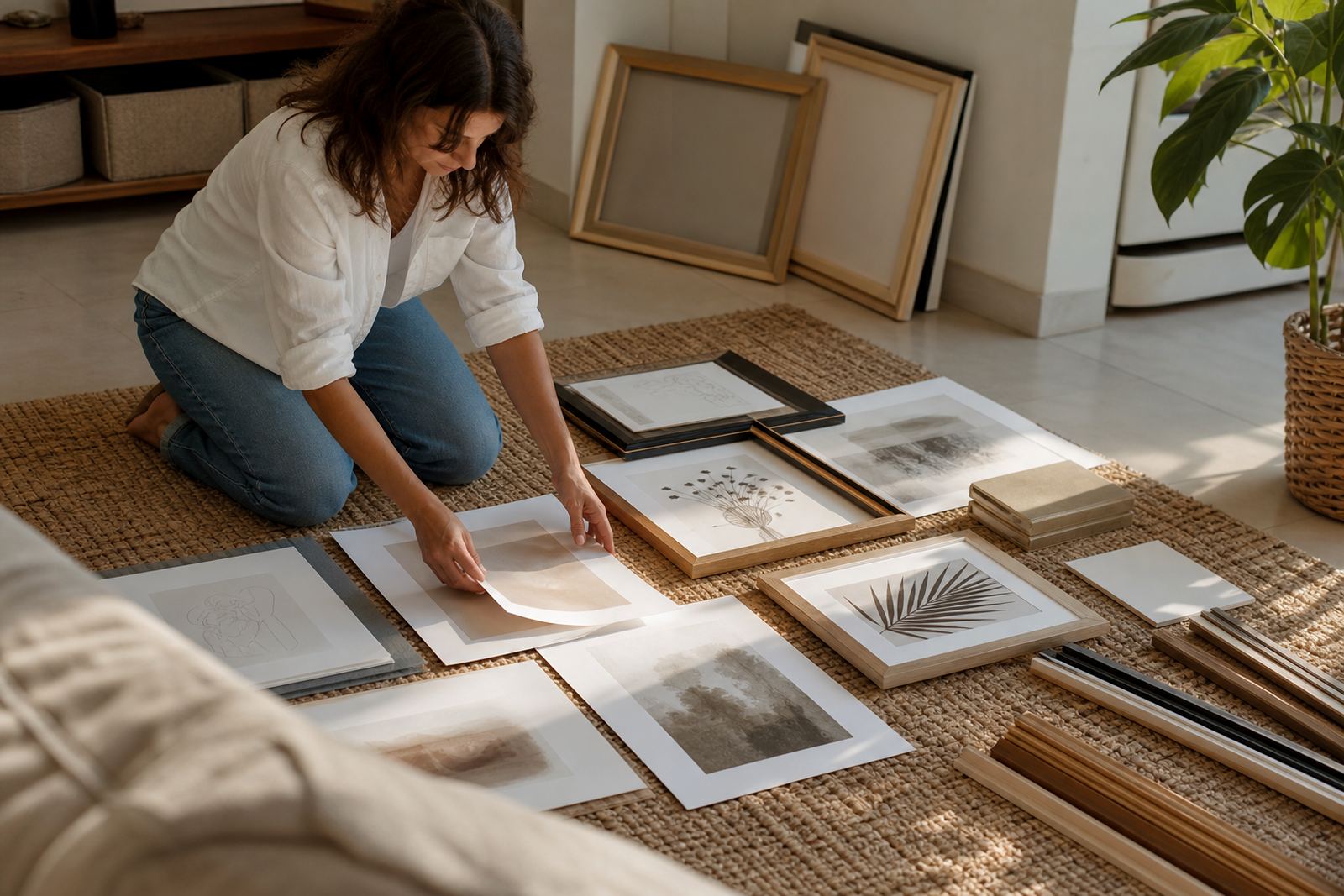
Not every image needs the same type of frame. Family photos usually suit cleaner profiles and lighter mounts, while original art may need a deeper frame or a more restrained finish. Certificates, school honours and maps of local places can also be part of a staircase wall, but they need enough breathing room so they do not look crowded.
At Bright Frames, the frame choice is often guided by where the wall sits in the home. A staircase near an open-plan lounge may need a warmer finish to connect with the rest of the décor, while a gallery wall in a more formal entrance can carry darker tones and stronger contrast. If the staircase receives strong sun through a nearby window, the glazing choice matters as well. A well-chosen frame can help protect paper prints from fading and keep the wall looking tidy for longer.
- Use lighter mounts for small photos and certificates
- Choose deeper or wider profiles for larger artworks
- Consider glare from windows, skylights and stair lighting
- Keep the finish consistent with the rest of the home
A Parkhurst staircase wall that feels planned, not crowded
In a Parkhurst home with a narrow staircase and a short landing, a good layout might start with two medium family portraits on the lower run, then move into three smaller travel prints on the turn, and finish with one larger artwork at the top. The frames can stay aligned to one centre line, with the same gap all the way through. That gives the wall a steady move upward, which suits a staircase better than a dense cluster of images.
For local homes in Johannesburg, Pretoria, Midrand or Cape Town, the most successful staircase gallery layouts tend to be the ones that respect the architecture first. Older houses often have deeper walls and more natural breaks, while newer homes may need a tighter arrangement because of glass balustrades or short flights. Our team often helps clients sort through a mix of photos, prints, canvases and framed keepsakes, then turns that collection into a layout that makes sense on the wall. A clear line and consistent spacing matter more than having everything the same size.
Plan the hanging job as part of the design
Once the layout is set, the hanging stage needs care. Staircase walls are awkward to measure from a ladder, and the angle of the steps can make a frame look straight when it is actually slightly off. It helps to mark each fixing point carefully, use level checks at every step and have another person view the wall from below. This is the point where many people realise that a good layout is only half the job; the hanging has to hold the line exactly.
If the project includes collection and delivery, or if the wall needs reframing, glass replacement or mirror framing alongside the gallery pieces, it is simpler to sort everything before installation day. That way, the frames arrive ready to go and the staircase is finished in one visit or one coordinated plan. The final result should feel settled, practical and easy to live with, not like a temporary arrangement that still needs one more adjustment.
For a staircase gallery, the best compliment is often that it looks like it has always belonged there. That comes from measured spacing, the right frame sizes and a line that carries cleanly from bottom to top, even if the wall turns once or twice along the way.