
Start With The Artwork, Not The Frame
A mount should support the piece first. Look at the main colours, the paper tone, the amount of white space and whether the artwork is busy or restrained. A strong image with deep colour often works well with a cleaner mount, while soft sketches, certificates and family photographs may need a warmer edge to stop them feeling flat.
In Johannesburg homes we often see art hung in bright rooms with lots of natural light, while coastal clients in Cape Town or Durban may want a calmer finish to suit humidity, glare and more varied wall colours. The best starting point is always to place the artwork on a neutral surface and check how the edges read from a short distance.
Choose Contrast, Subtlety Or Warmth
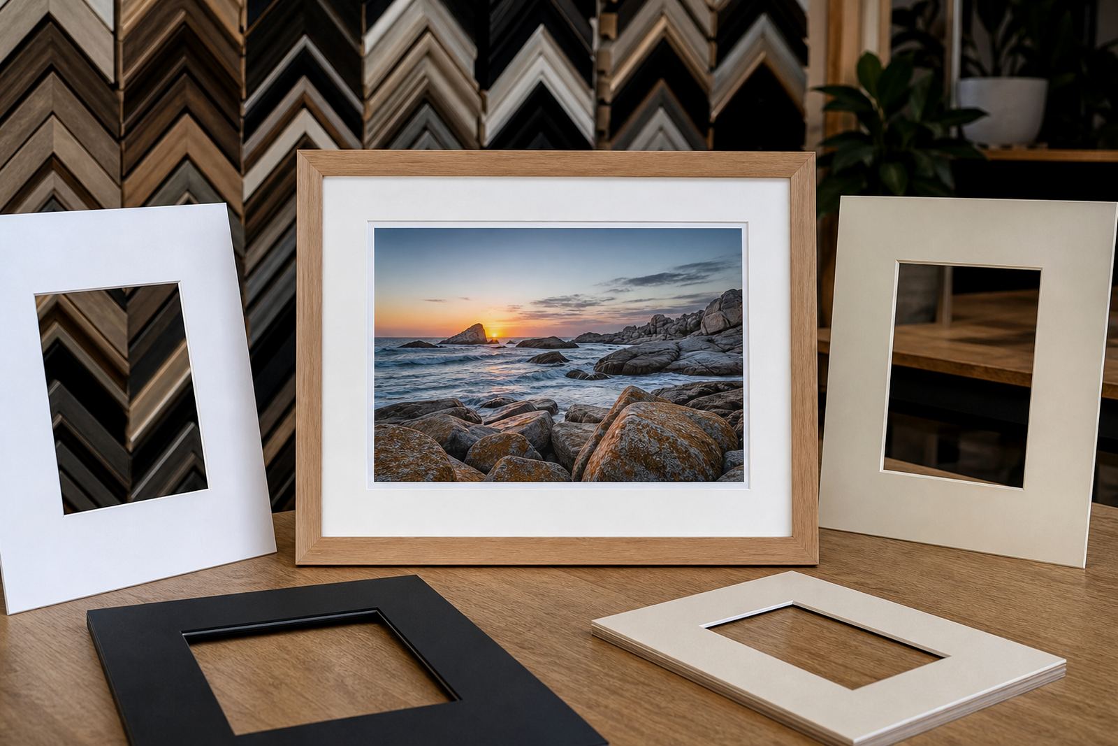
Mount colour does one of three jobs. It can create contrast, which makes the artwork stand forward. It can stay subtle, which keeps all attention on the image. Or it can add warmth, which softens cooler prints and monochrome photographs.
- Contrast: use with dark, detailed or contemporary artwork that needs separation from the frame.
- Subtlety: use with delicate drawings, certificates or works with clean edges.
- Warmth: use with family portraits, sepia images and paper that already has cream or ivory tones.
If you are framing a gallery wall, keep the mount colour consistent across a set. That gives the room order even when the images themselves are different. For homes in Sandton, Rosebank or Midrand, this is often the easiest way to make mixed artwork feel planned.
Match The Paper Tone Before You Match The Wall
Many people start with the wall colour, but paper tone is usually more important. A bright white mount against warm paper can look too sharp. A cream mount on cold white paper can make the artwork look dull. Hold the mount sample next to the paper edge and check whether it looks natural in daylight.
Use this quick check before you decide:
- Does the paper look bright white, off-white or cream?
- Are the image colours warm, cool or mixed?
- Will the piece hang in strong sun, shaded light or artificial light?
- Does the room need a calm finish or a bit more definition?
For works that will sit under glass, light reflection matters too. A pale mount can help reduce a heavy look, but if the room is very bright, too much white may reflect more than you expect.
Use Mount Colour To Handle Light And Space
Mount colour also changes how a framed piece behaves in a room. Dark mounts can make a small artwork feel more intimate. Light mounts can open up a piece and give it more breathing room. In smaller apartments or passage walls, a light mount often keeps the work from feeling crowded. In larger living spaces, a deeper mount can help a small image hold its own.
In coastal towns the light can be harsh and reflective. For those spaces we often suggest a softer mount rather than a very bright white. In older homes or heritage interiors, cream, ivory and warm grey usually sit better than sharp black or brilliant white. If the artwork is going into a gallery, the wall colour and spacing between works should also be considered so the mount does not compete with the curation.
Build A Simple Selection Method
If you are unsure where to begin, use a practical step by step approach. It saves time and keeps the choice grounded in the artwork itself rather than a trend.
- Lay the artwork flat in good light.
- Test two or three mount shades only, not ten.
- Compare warm neutrals and cool neutrals side by side.
- Step back two to three metres, then look again.
- Check the sample in daylight and under indoor light.
- Confirm that the frame profile still works with the mount colour.
This method works well for homes, studios and offices alike. It is also useful when you are framing several pieces at once, because it keeps the series consistent. At our Parkhurst studio, we often use this process with photographers, collectors and clients framing school awards, certificates or original artwork for a reception area.
When To Keep It Neutral And When To Choose Colour
Most frames look best with a neutral mount, but there are times when a coloured mount is worth considering. A muted green, stone, charcoal or soft beige can work well if it relates directly to the image and room. It should look intentional, not decorative for its own sake.
Choose a coloured mount only if one of these applies:
- The artwork contains a clear accent colour you want to repeat.
- The piece needs extra depth and a plain neutral feels too flat.
- The display space has a strong interior palette and the frame should sit into it.
- You are framing a set and need one accent tone to tie the series together.
If the artwork is valuable, original or sentimental, keep the colour choice restrained. A strong mount can age quickly while a careful neutral tends to stay useful for longer. That matters for clients who may rehang the piece in another room or another home later on.
Bring The Piece In And Fine Tune The Detail
Mount colour is best decided with the artwork in front of you. Printed swatches alone can be misleading because light, texture and paper weight all change the result. A studio visit lets us compare the mount to the image, the frame sample and the intended room. We can also advise on mount width, which affects how much colour you actually see around the work.
Bright Frames offers custom framing, mount cutting, reframing, glass replacement and collection and delivery across Johannesburg, Pretoria, Midrand, Sandton, Rosebank, Cape Town and Durban. Whether the job is a single family photo or a full gallery run, our team will help you settle on a mount that suits the artwork and the space, no fuss.