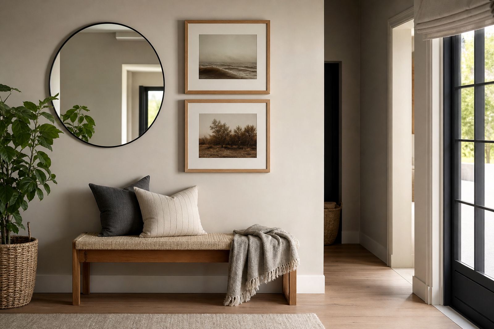


Why black and white frames keep getting chosen
Black and white frames stay popular because they do not fight with the picture. They give a clean edge, let the artwork carry the weight, and work in homes, offices and galleries where styles can change over time. At Bright Frames in Parkhurst, we see them chosen again and again for family photos, charcoal sketches, watercolours, certificates and exhibition pieces.
There is also a practical side. A black frame can make a piece feel more defined, while a white frame can open it up and make it feel lighter. That makes them useful in South African interiors, where one room may have dark wood floors, another may have white walls and plenty of winter sun, and a third may need something that sits quietly beside a large sofa or a feature wall.
For homes in Johannesburg and Pretoria, where many clients mix modern pieces with older furniture, these two colours often solve the same problem in different ways. One gives contrast, the other gives calm.
When a black frame is the better fit
Black frames usually work best when you want strong definition. They are a good match for photography, line art, monochrome prints and certificates, especially when the wall colour is pale. Black gives a crisp border and can help a small work stand out on a large wall. It also suits gallery walls where different images need one common thread.
In a Parkhurst home with white walls and oak shelving, a slim black frame can bring order without looking heavy. In a Durban apartment with lots of natural light, black can help control the visual brightness of a room and stop framed pieces from disappearing into the glare.
- Best for black and white photography
- Useful on light walls and bright interiors
- Good for strong lines, text and modern art
- Helps one frame system unify mixed images
Black is not only for modern spaces. It can also suit traditional artwork if the mount is well chosen and the moulding is not too thick. A narrow black frame around a botanical print or old print can look very orderly, especially in a passage or study.
When a white frame makes more sense
White frames are the quieter choice. They are useful where you want the framing to disappear a little and let the image breathe. They often work well for pastel drawings, soft landscapes, children’s art, wedding photos and pieces with a lot of open space. White can also help keep a room feeling fresh, especially if the walls are already dark or coloured.
In coastal homes around Cape Town or Durban, where humidity and salt air can affect finishes, a clean white frame with the right protective materials can keep a room feeling airy and neat. In a bright Midrand office, a white frame can keep the wall from feeling too busy when several pieces are grouped together.
- Best for light artwork and soft colours
- Helps small spaces feel less crowded
- Works well for family memories and nursery art
- Good choice for coastal and sunlit rooms
One thing to watch is the tone of white. Some whites are warm and creamy, others are cool and crisp. That small difference matters more than most people expect, and it can change how the image reads from across the room.
How the room decides more than people think
Frame colour should never be chosen in isolation. The wall colour, floor colour, furniture and lighting all play a part. A black frame against a dark charcoal wall may disappear too much. A white frame on a cream wall may look flat if there is not enough contrast. The same artwork can feel completely different depending on where it hangs.
For galleries and homes alike, it helps to stand back and look at the full setting. At Bright Frames, we often ask where the piece will hang, how much daylight it gets, and whether it needs to sit quietly or make a stronger statement. That is especially useful for clients across Johannesburg, Sandton and Rosebank who are framing several pieces at once and want a consistent look.
Load-shedding can also affect how a frame reads. Under warm lamp light, black can look softer and white can feel warmer too. Under cool daylight, the same frames may seem sharper. A quick test in the actual room, if possible, saves a lot of guesswork.
The mount, glass and moulding matter as much as colour
Black or white is only part of the decision. The mount opening, glass choice and moulding profile all change the final result. A black frame with a wide white mount can look very refined. A white frame with a narrow off-white mount can feel calm and balanced. If the moulding is too thick, even a simple colour can start to feel heavy.
For artwork that needs protection, glass replacement and the right glazing are worth thinking through carefully. In busy homes, especially where children or pets are around, the frame should be practical as well as neat. For canvas stretching or reframing, the colour choice can be used to sharpen the work or soften it, depending on the piece and the room.
- Pair black frames with white or pale mounts for contrast
- Use white frames with warm mounts for softer artwork
- Choose slimmer profiles for smaller rooms
- Consider glare, dust and handling when selecting glass
A good frame should not only look right on day one. It should still make sense months later when the light shifts, the furniture moves and the room is used every day.
A local example from Parkhurst to Pretoria
A Parkhurst client came in with three family photographs and one charcoal sketch for a passage wall. The wall was pale, the floors were dark, and the room got strong afternoon sun. The photographs were framed in slim black, while the sketch was given a white mount and black frame so the set felt connected. The result was neat, balanced and easy to live with.
We see the same thinking across Pretoria, Midrand and Sandton. In one home the black frame is the right answer because the walls are light and the art needs definition. In another, white is better because the room already has enough visual weight. There is no single rule, but there is a good habit: choose the frame that supports the picture, not the room’s current mood.
For clients who need collection and delivery, installation, or gallery hanging, the same principle applies. A frame should be chosen for the piece, the setting and the long term use of the wall. That is where practical advice saves time and prevents redoing work later.
Choosing between black and white without second guessing it
If you are torn between the two, start with the artwork itself. Ask whether the piece needs contrast, calm, warmth or more space around it. Then look at the room and decide whether the frame should stand out or step back. In many cases, that answer becomes clear very quickly.
Black is the steadier choice when you want structure. White is the better choice when you want lightness. Both can work in homes, galleries and offices across South Africa, from Cape Town to Durban, if the proportions and finish are handled properly. The best frame is not always the one people notice first, but the one that keeps making sense every time they walk past it.
That is the real value of a simple colour done well. It lets the work speak, and it keeps the room tidy without trying too hard.