
Start with the print, not the frame
Photography framing works best when the print leads the decision. Before choosing a profile or colour, look closely at the image itself. Is it a crisp black and white portrait, a saturated colour landscape, or a quiet fine art print with soft tones and visible paper grain? Each one asks for a different treatment. A strong image with clean edges often suits a narrower frame, while a softer print may need more visual space around it.
The surface of the paper matters just as much. Matte papers reduce glare and suit galleries with controlled lighting, while gloss and metallic finishes can look sharper but also reflect more, especially in rooms with big windows. In Johannesburg homes where afternoon sun can move across a wall, that detail matters. A print that looks perfect at 9 am may show every reflection by 3 pm if the glass choice is wrong.
As a rule, the frame should support the photograph and not compete with it. If the picture carries most of the colour, the frame can stay quieter. If the image is subtle, a carefully chosen moulding can give it presence without overpowering it, which is often the difference between a print that sits on the wall and one that feels properly finished.
Mounts create breathing room and improve presentation
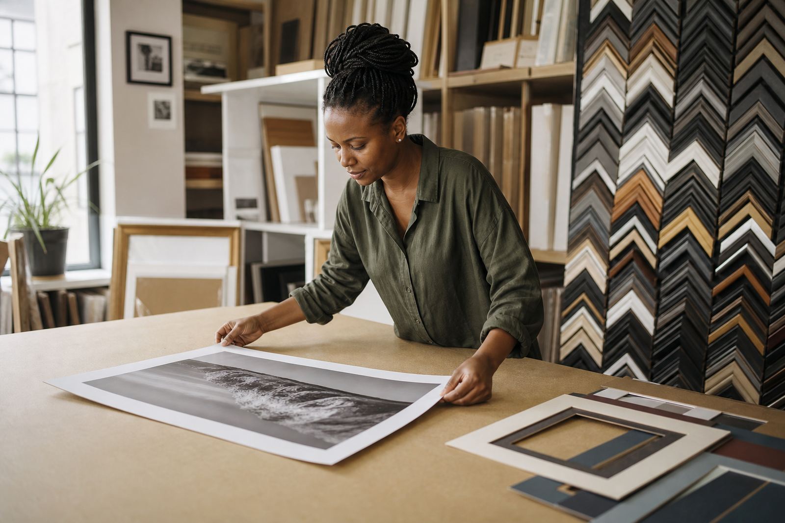
A mount is not just a border. It creates breathing room, helps the eye settle and keeps the image from feeling cramped. For smaller prints, a wider mount can make the work feel more considered. For larger pieces, the mount size should be balanced so the photograph still feels anchored and not floating in a sea of white.
Colour choice is equally important. Pure white is not always the best option. Off-white, ivory and soft grey can complement warmer portraits, film scans and archival papers better than a stark bright white. For monochrome photography, a slightly warmer mount can soften the overall feel, while cool grey can suit industrial scenes or urban studies. The aim is simple, the mount should support the image rather than distract from it.
- Use a wider mount for smaller prints that need visual space.
- Choose off-white or ivory for warm-toned photographs and aged paper.
- Match the mount depth to the size of the frame so the print does not feel sunken.
- Keep the mount board acid-free for long-term display.
For collectors in Sandton or Rosebank, where many homes mix art with polished interiors, a well-cut mount can also help a print sit naturally among furniture, timber and painted walls instead of looking forced.
Choose glazing for the room, not only the artwork
Glass selection has a real effect on photography display. Standard clear glass works in many cases, but reflections can become a problem in rooms with strong daylight or artificial lighting. That is why the room should guide the choice. A north-facing apartment, a gallery corridor with downlights, or a family room with mirrors nearby each create different conditions.
For delicate prints, especially those with rich blacks or subtle shadows, low-reflection glazing can make the image easier to view from across the room. It is particularly useful in homes with open-plan living, where the print may be seen at different angles throughout the day. In coastal areas like Durban, humidity also plays a part. Proper framing materials and sealed construction help protect the print from moisture movement over time.
- Clear glass suits framed prints that will hang away from direct light.
- Low-reflection glass helps reduce glare in bright rooms and galleries.
- UV-filtering options are worth considering for valuable or archival prints.
- In humid areas, ensure the backing and sealing are done carefully.
Good glazing should improve the viewing experience without making the print look dull or cloudy. If the image loses its depth under the glass, the choice needs to be revisited.
Frame colour should echo the photograph, not the sofa
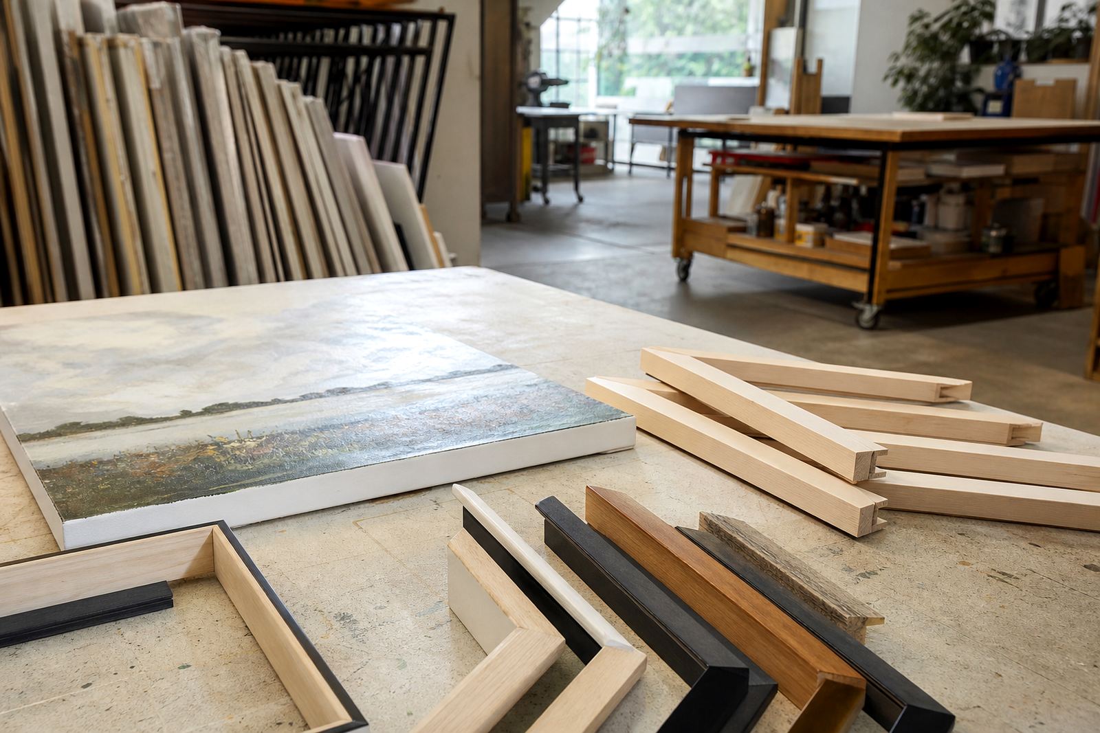
It is easy to choose a frame based on the room alone, but the better approach is to let the photograph and the room talk to each other. Timber tones often suit natural light, landscapes and documentary work. Painted finishes can work well for modern interiors or high contrast monochrome images. Metal looks neat in galleries and contemporary homes, especially where the print has a clean edge and a strong composition.
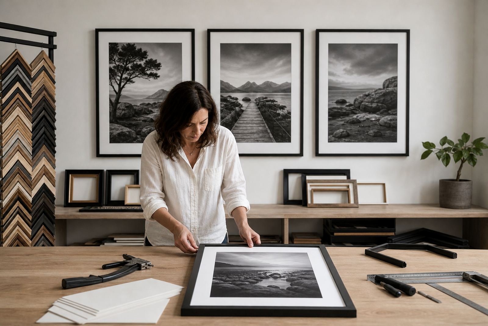
The frame should also be sized to the image. Thin profiles work well for grouped prints, while a slightly deeper profile can help one feature photograph stand out. For a home in Midrand with a mix of art and family photography, one wall may hold several related prints in matching frames, while another wall carries a single larger piece in a more substantial profile. That kind of planning keeps a home from feeling overdone.
Practicality matters too. In some Johannesburg properties, walls can shift slightly with age and seasonal changes, so the hanging method and overall weight should be considered before final selection. A frame that looks elegant but is awkward to hang creates more problems than it solves.
Gallery walls and home collections need different handling
A gallery wall in a commercial space is not the same as a family photo wall at home. In galleries, consistency usually matters more, so spacing, scale and frame repeat can keep the work orderly and easy to read. In a home, there is more room for variation, but the display still benefits from a clear visual plan. Too many frame styles can make the wall feel busy.
For photographers showing series work, repeat sizes and repeat mounts can create rhythm. For a family collection, you may want one common element such as the same frame colour or mount tone, then vary the print sizes. That gives the wall personality without making it chaotic.
- Use even spacing for gallery walls so each image has room to breathe.
- Keep one shared detail across a home collection, such as frame colour or mount tone.
- Mix sizes carefully so the largest print does not overpower the smaller ones.
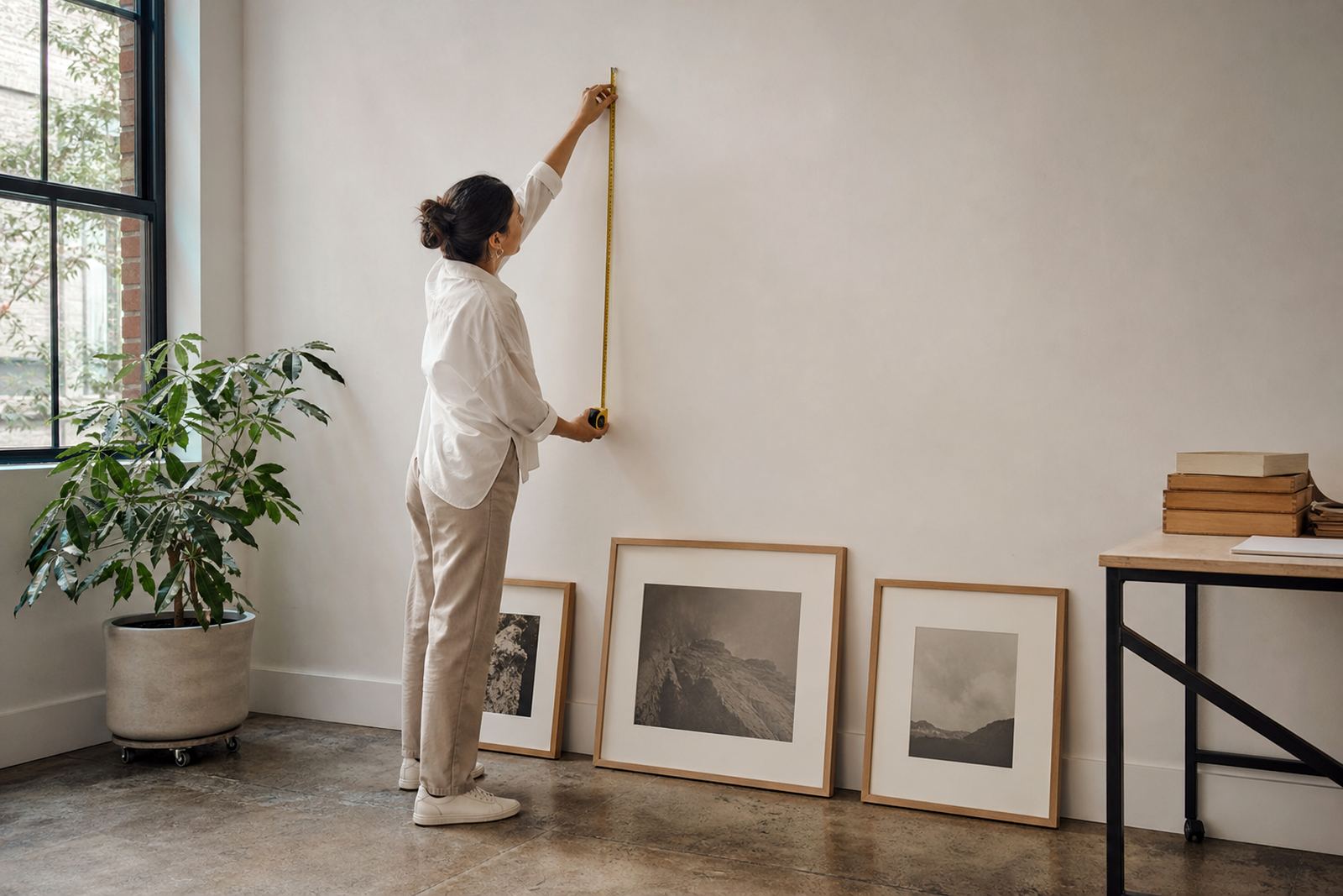
- Plan the hanging line before drilling, especially on plaster or older brick walls.
In a Parkhurst studio setting, the same photograph can be framed very differently depending on whether it will hang in a private home, a restaurant, or a gallery. The display context should always guide the finish.
When installation and handling make the difference
Even the best framing can fall short if the print is handled badly or hung poorly. Finger marks, uneven spacing and an unsuitable wall position can spoil the result. That is why collection, delivery and installation matter just as much as the making. A print should arrive clean, level and ready to hang, with the right fixings for the wall type and the weight of the frame.
This is especially important for larger photographic works or framed sets that need to line up accurately. If a set of three is even a few millimetres off, it shows. The same goes for mirrors and mixed media pieces that sit beside photography in a room. Careful installation saves time and prevents unnecessary damage later.
For clients across Johannesburg, Pretoria, Cape Town and Durban, practical support can be the difference between a print that ends up in storage and one that is actually displayed. A framed photograph should feel finished from the moment it goes on the wall, not after several attempts to straighten it.