

Why timber changes the feel of a framed piece
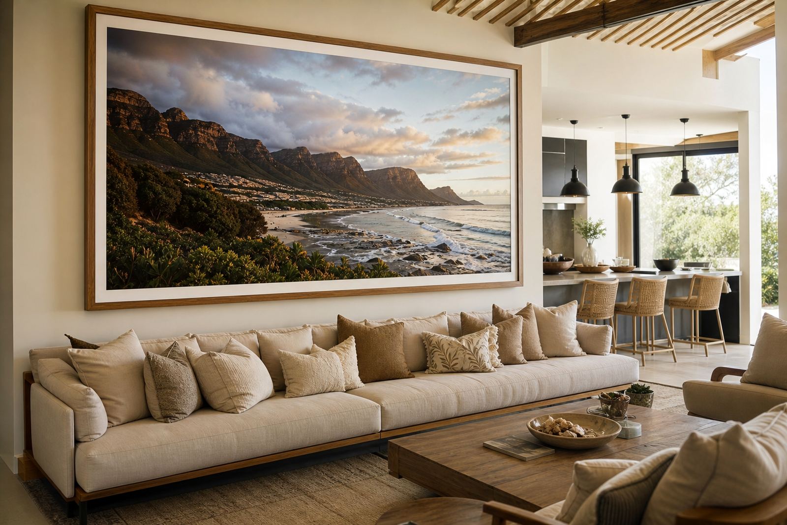
Timber has a way of softening a wall. Where metal can feel crisp and modern, wood adds warmth, which is why it works so well in homes, studios and gallery spaces that need a more grounded look. In Parkhurst, where older homes often mix pressed ceilings, pale walls and dark floors, a timber frame can tie the room together without shouting for attention.
It also brings a practical benefit. Timber profiles can be cut in a wide range of widths and depths, so they suit everything from a small family portrait to a large print or canvas. When matched properly to the image, the frame does more than hold the piece in place, it helps it sit comfortably in the room.
Choose the timber tone before you choose the profile
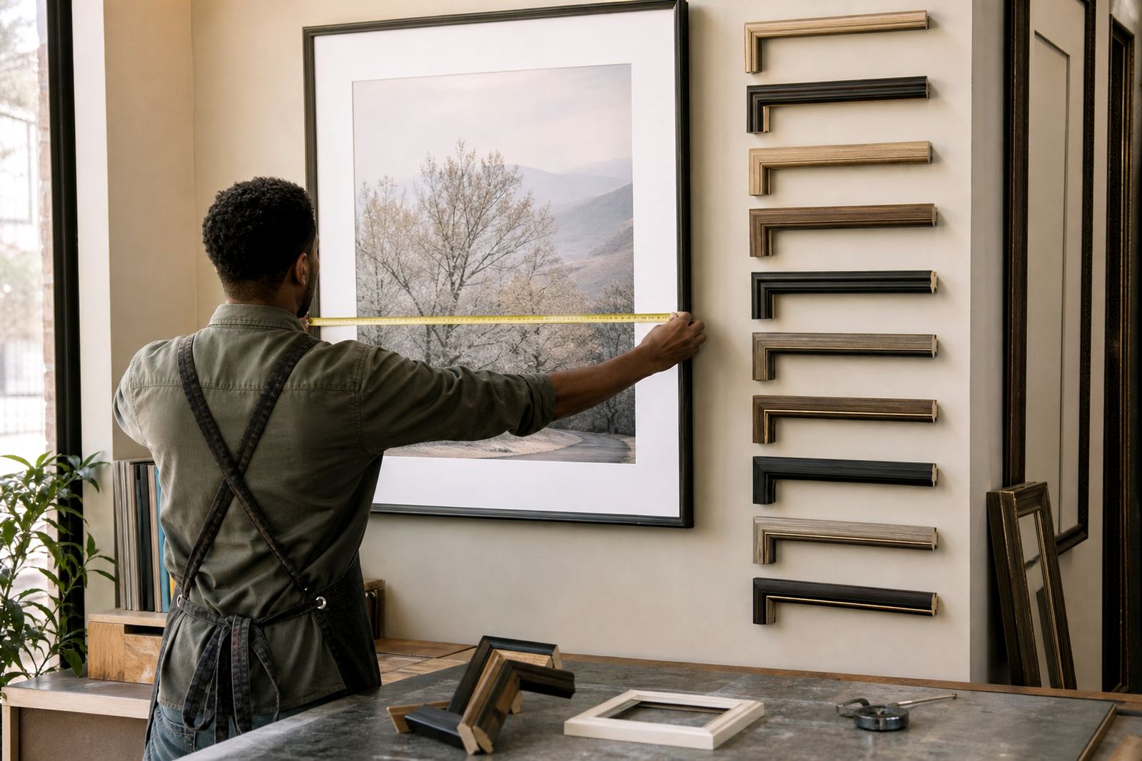
The first decision is usually colour. Light timbers feel airy and clean, while darker tones add weight and formality. Mid-tone finishes sit comfortably between the two and are often the easiest choice for mixed interiors. If a room already has a lot of wood furniture, floors or ceiling beams, a frame that is slightly lighter or darker than the other timber finishes usually works better than an exact match.
For framed photography, a narrow timber profile often keeps the focus on the image. For paintings, certificates or larger artworks, a broader profile can give the piece more presence. The grain matters too. A visible grain gives a natural look, while a smoother finish feels more refined and controlled.
- Light oak-style tones suit bright rooms, coastal homes and simple line drawings.
- Walnut-style and dark brown finishes work well with black-and-white photography and formal interiors.
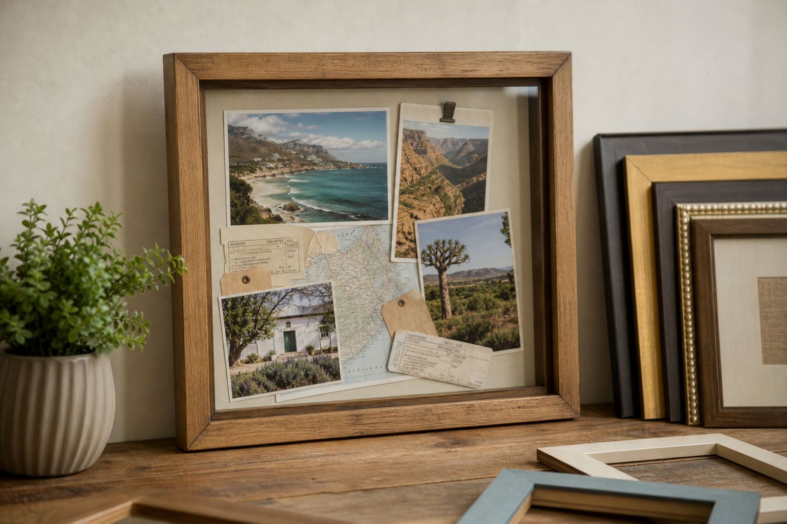
- Natural finishes suit botanical prints, family photos and art with earthy colour palettes.
- Painted timber finishes can bridge traditional and modern décor without losing the warmth of wood.
Match the frame to the artwork, not the wall colour
A common mistake is choosing timber to match the wall. The better approach is to look at the artwork first. Consider the main colours in the image, the amount of white space around it and whether the piece feels calm or bold. A warm timber around a cool-toned print can balance the work beautifully, while a very red or orange wood tone can overpower softer images. It sounds simple but it catches people out.
At Bright Frames, the best results usually come from looking at samples beside the actual artwork, not under shop lighting alone. A frame that looks rich indoors may read very differently once it is hung in a sunlit lounge or a north-facing passage. In Johannesburg homes, especially those with strong afternoon light, we often suggest a finish that still holds its colour without becoming too shiny.
When timber suits homes, galleries and offices
Timber frames are not just for living rooms. They work well in galleries because they can carry both contemporary and traditional art without feeling too severe. In offices, reception areas and boardrooms, timber can make a space feel more welcoming and less clinical, which matters when clients walk in and look around. For framed awards or certificates, a clean timber profile gives formality without the coldness of plastic or metal.
In galleries, the main question is how much the frame should support the work. A delicate drawing may need a slim profile and a clean mount, while a large canvas may call for a deeper style that sits confidently on the wall. For homes, the choice is more personal and often depends on the room’s furniture, floor finish and how much natural light reaches the wall.
- Living rooms often suit mid-tone or natural timber with a wider profile.
- Bedrooms usually look better with softer tones and slimmer edges.
- Passages and stairwells can handle bolder timber finishes because there is less furniture competing for attention.
- Gallery walls work best when timber widths are kept consistent across the group.
What to ask for when ordering a timber frame
Good framing starts with a clear brief. Bring the artwork, the measurement and any notes about where it will hang. If you are framing for a humid area, such as a coastal home in Durban or a bathroom wall in a busy guest house, it is worth asking about the right backing, glazing and finish for that environment. Timber itself can be stable, but the full frame system needs to suit the room.
You should also ask about the mount colour, the width of the frame face and whether the piece needs spacers, especially for artworks that must not touch the glass. For larger jobs, it helps to discuss wall fixing and weight, because a timber frame that looks modest can still be heavy once glazing and backing are added. In Midrand and Pretoria, where many clients hang framed family collections in open-plan spaces, we often plan the mounting before the frame is cut.
- Check whether the timber finish is smooth, textured or visible-grain.
- Ask how the frame will respond to sunlight, heat and coastal moisture.
- Confirm the wall type if the piece will be installed on brick, plasterboard or concrete.
- Request advice on glass or acrylic if the framed item will travel often or hang in a public area.
A local example from Parkhurst to Pretoria
A client in Parkhurst recently brought in three black-and-white family photographs and wanted them to sit in a hallway with pale walls and dark floors. A narrow warm timber profile with a soft grain was the right answer, because it echoed the wood in the home without making the images feel heavy. The same frame style would have looked different in a bright Pretoria townhouse, where stronger light and larger wall spaces often call for a slightly bolder finish.
That is the point with timber frame styles. They are not only about taste, they are about balance. A good frame respects the image, the room and the way the home is used every day. Whether the piece is going to a gallery in Cape Town, a family home in Johannesburg or an office in Sandton, the timber should feel like it belongs there. And if the artwork has sentimental value, the right frame can make it feel more complete, not just more decorated.
How Bright Frames helps you choose the right timber look
Bright Frames offers custom framing and ready-made advice from the Parkhurst studio, with support for clients across Johannesburg, Pretoria, Midrand, Sandton, Rosebank, Cape Town and Durban. The team works through timber styles, profile widths, mounts, glazing and finishing details so the final frame suits both the piece and the room. That matters when you are framing a school certificate, a canvas, a mirror or a print that has to last.
Clients often arrive with a clear idea of the colour they want but are not sure about the style. That is where personal service makes a difference. A few sample options, a careful look at the artwork and a practical conversation about where it will hang usually point to the right answer. It saves time and avoids those awkward moments when the frame is beautiful but the artwork gets lost in it.